Design & Colors
We strive for a user interface that is clutter-free, well-organized, and doesn't behave in unexpected ways. It should work across a wide range of devices and be easy to use for everyone.
Theme Colors
Theme definitions live in frontend/src/options/themes.js, with the actual palette tokens mapped to Vuetify in frontend/src/css/themes.css and frontend/src/css/root.css. When you change default colors, update both the JSON structure (so new installs pick it up) and the CSS variables (so runtime theme switches keep working). Avoid editing Vuetify’s compiled CSS directly — always override via our vuetify.css layer.
The colors we use should be consistent and functional, for example, provide sufficient contrast. For the included themes, the preferred primary colors are violet and cyan, but other colors can be used as well.
To avoid distorting the visual impression of photos and videos, large background areas should generally be neutral or just slightly saturated.
Context Menu
The context menu at the bottom right should use a color spectrum for the individual actions to reflect the spectral colors of a prism:
Icon Fonts
Vuetify is configured to use Material Design Icons (MDI) through frontend/src/app.js and frontend/src/options/themes.js. Stick to Google’s Material icon set unless a feature requires a bespoke pictogram; mixing icon packs makes the UI look inconsistent and adds extra font downloads.
Inspirational Quotes
Design is a funny word. Some people think design means how it looks. But of course, if you dig deeper, it's really how it works.
— Steve JobsChoice is the enemy of productivity. Put another way, if your solution does everything, and has no opinions about anything, then it solves nothing.
— Asim AslamAny fool can make something complicated. It takes a genius to make it simple.
— Woody Guthrie
External Resources
Color Schemes
- https://www.nordtheme.com/#palettes-modularity
- Scheme Color Finder
- https://www.schemecolor.com/?s=colorful
- https://www.schemecolor.com/?s=google
- https://www.schemecolor.com/memories-of-the-garden.php
- https://www.schemecolor.com/double-disclosure.php
- https://www.schemecolor.com/true-lovers-color-scheme.php
- https://www.schemecolor.com/sunset-painting.php
- https://www.schemecolor.com/happy-with-self.php
Web Color Tools
- Adobe Color Wheel
- Artyclick Color Name Finder
- Coolors Color Palette Generator
- FFFuel HEX, RGB & HSL Color Picker
- iColorpalette
Related Content
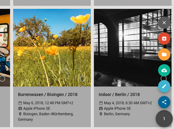
- Screenshots - development of our user interface in time lapse ⏱
- The 7 pillars of design - slides by Raffaella Isidori (Codemotion Berlin 2018)